Decide what needs to carry the idea
Motion graphics puts design into motion: typography, shapes, imagery, diagrams and visual systems. Character animation centres on performance, using a figure’s actions and reactions to communicate something. They can overlap, and many films use both. The distinction is a useful starting point rather than a rigid boundary.
Ask what the audience needs from the film. A clear sequence of information may work through graphic transitions and carefully timed text. An awkward situation, emotional change or moment of humour may benefit from a character who experiences it.
When graphic movement earns its place
A graphic approach can give an existing brand identity rhythm and personality. Colour, type and composition become part of the storytelling. It is particularly useful when the film needs to connect several abstract ideas or adapt across event screens, promotional clips and other formats.
Our Spotify Insights Unwound work combines vibrant design with 2D animation for an event, including stings and lower thirds. The useful lesson is that movement can extend a visual language rather than simply decorate a static layout. Timing and transitions need to feel related to the identity they belong to.
When a character makes the difference
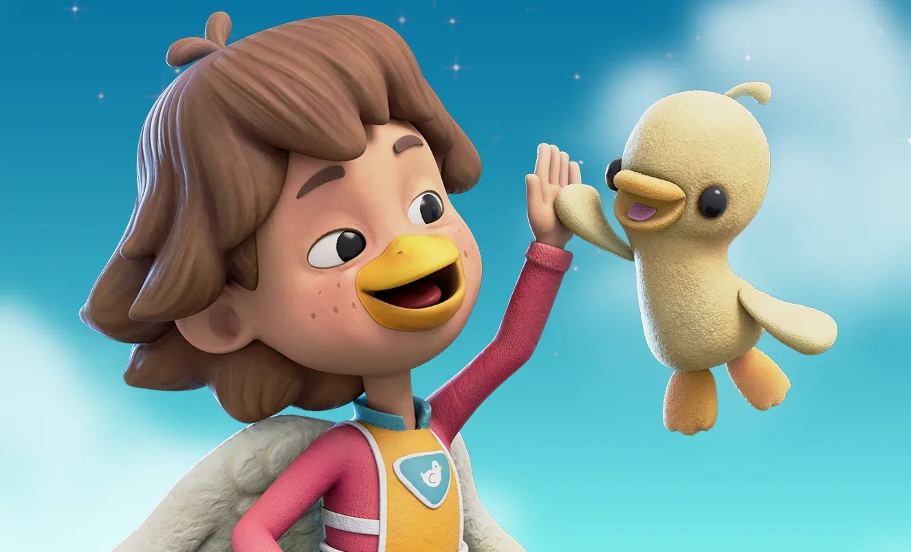
A character can give the audience a point of view. A puzzled glance or a small decision can make a situation recognisable before it is explained. That does not mean every film needs a mascot. A character should have a job within the story, not just occupy space while the voice-over does everything.
Character work introduces design and performance decisions: who the figure is, how they move and how their expressions fit the tone. A restrained performance may be exactly right. More movement is not always more engaging, particularly when a specific message needs room to land.
They can work together
A character may guide the audience through a graphic explanation. Typography can support a performance without competing with it. A diagram can clarify the practical point after a scene has introduced the human problem. The challenge is to establish a hierarchy so that viewers know what matters in each moment.
When reviewing a concept, temporarily remove either the character or the graphics and ask what is lost. If nothing meaningful changes, that element may not be doing enough. If the message becomes clearer, simplify.
Choose the balance through the brief, not a preference for a category label. References can help, but explain which qualities you want: clarity, humour, warmth, precision or energy. That gives the creative team a stronger starting point than “make it animated”.